
EVERYWOMAN'S
HEALTH CENTRE
(EWHC)
#UI Design
#Logo design
#Responsive web
#Woman’s reproductive health clinic
OVERVIEW
Our client — Everywoman’s health Centre (EWHC), is a woman's reproductive health clinic based in Vancouver.
Even though being constantly updated, our client’s existing website does not meet the needs of nowadays clients in aspects of aesthetics and functionality, that is why our client approached us for a total website re-design.
PROJECT ATTRIBUTES
– Digital Illustrations
– Logo Design
– Responsive Web Design
FACT SHEET
Timeline: 3 weeks
My Role: Lead UI Designer
Team: Richard Jiang, Corina Sirbulescu, Julie Bi, Katrina Yu
My UI Methods: Design Inception, Gut Test, Moodboard, Style Tile, Logo Design, High Fidelity Prototyping, Style Guide
Tools: Adobe Illustrator, Adobe Photoshop, Sketch, InVision
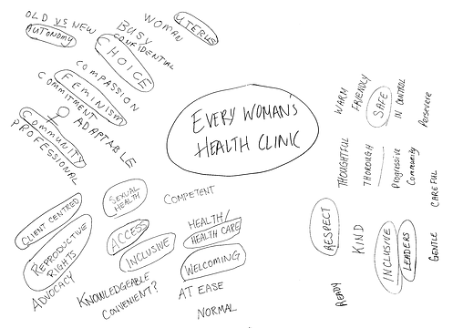
CLIENT'S
MIND MAP
During the initial kick-off meeting, we asked our client to mind map some key words they would use to describe EWHC.
“Choice”, “Safety”, “Feminism” and “Welcoming” can be found from the key words they wrote down. Our client also talked about how they wanted to create a space where abortion is de-stigmatized where women can safely make a choice and live their lives the way they want.
RESEARCH
RESULTS
To start our research, we conducted a gut test with a wide range of participants onsite the clinic. A gut test is a collection of screenshots from various styles of apps and websites. We took these screen shots and made them into a slideshow presentation. We prepared 20 screens and gave each participants 20 seconds to score each one of them.

From the gut test, we can see clearly that our client liked blue, teal, green, purple in the colour palette, they enjoyed big boxy selections , icons and imagery, as well as simple and modern styles. They could not accept red, which represents blood, or anything that is either too dark or too minimal/fashionable.
With the results of our gut test, we were then able to integrate them into our design inceptions.
DESIGN
INCEPTION
1. The "Why"
Based on our interview results with the client, we have decided to go with “Woman can continue on with the life that they choose.” We want to come up with a design that would bring relief to our target audience so that they are able to continue with a life of their choice without worry about the rest.
2. Logos
As UI designers, we would also like to design a logo that would help our client with their branding.

Our client’s current logo is pretty dated. A new logo design would be beneficial for rebranding together with the website redesign. So let’s get started to explore logo design options:

This was my first trial, I worked around keyword “woman”. The main element here is an illustrated woman wearing hollyhocks flower on her head. I then made 4 of them in the shape of a pinwheel, which represents everywoman.

This was Corina’s design, she wanted to take the concept of EWHC's original hollyhocks mural but simplified so it would translate better into a logo.
We asked for comments from the client, and it seemed the idea of hollyhocks was very appealing to them. They loved the Asian symmetrical style since a lot of their target audience come from Asia.
Based on client’s feedbacks, I went with the symmetrical hollyhocks flower design and made it more formal and appealing.

I started with sketch on the paper first. Since our client liked Asian styles, I combined elements of Chinese painting into the shape of flower. Then I created outlines in Adobe Illustrator. In the end, I filled the petals with our theme colours — dark blue and teal. Each petal is in the shape of an abstract “W”, meaning woman. So in total six petals represent “everywoman”, which is our theme.
To complete the logo, I added text in the Catamaran typeface, with an emphasize on “Everywoman’s” as per the clients request.
I also made a vertical version, with everything centred. This can be used on business cards and etc.
3. Final UI Design
Under the "Why", I came up with my design direction: to help women make their own choices, I believe my design has to be very approachable and empathetic, and portray a free atmosphere for our users to be focused on decision making and not worry about the rest.

Above is my corresponding mood board. Images with blue and teal background showcase a very clean and clinical vibe. And then yellow, pink and floral colours bring a very bright and feminine touch to the design.

I also created a customized illustration, I included Ms. Cheryl Hamilton together with her symbolic hollyhocks mural that was at EWHC's original location, as well as Dr. Mollie Rawling who contributed her life's work to EWHC.
This illustration not only represents EWHC’s history heritage, the images of 2 women of different ages also imply to the target audience that EWHC helps women from different ages in a supportive, safe and non-judgmental setting.

This was my original style tile, I combined elements like the hollyhocks flowers and illustrations which would link back to the culture and history heritage of EWHC. The typeface I chose were Catamaran and Arya, which are very feminine sans serif fonts. I also included a scrolling bar design for the users to navigate services that everywoman’s provides.
However, after getting feedbacks from our client, we have decided to revise the style tile to a big extent.

In the end, we got rid of all illustrations, and replaced them with more realistic photo hero banners. We tried different stock photos and then decided to use this imagery of a woman on top of the mountain. This is because our client demanded a non-specific female image that could be of any race, in a natural environment.
We also got rid of the colour pink and added a lighter blue for a more vivid look.
After some font-paring experiments, we changed the body typeface to Arsenal due to client’s preference on an all sans-serif website. All of the typefaces that we chose for this website — Catamaran, Arsenal & Arya, are not only very legible, but also very soft and feminine that fit our theme.
As a bonus, we designed a set of icons with 3D shadows. These icons are meant for people who just want to glance over the site and don’t necessarily read everything.

We also incorporated 2 elements that our client mentioned a lot — boxy selections and colour overlay above image, into the design of every web page. For pages with ultra long contents, we also applied a column system for easy content browsing.

For mobile page designs, we continued with our desktop style. However, we designed a hamburger menu for the relatively compact screen size, featuring a 3-level dropdown menu.
SUMMARY
Our design helps users continue on with the life that they choose by providing them with a platform to comfortably search for information and clear doubts, as well as to be able to make a decision with people they can trust.
